brainfag: swords and boobs?
posted in Home Jabber on January 27, 2008
I'm getting close to finishing up a Brainfag anthology book that is going to be put out by microcosm publishing (asssuming they don't read it first, HA! jk) and there was concern that my first cover idea:
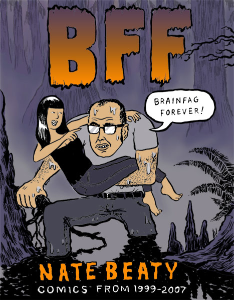
was too "crappy superhero graphic novel looking, like it's full of swords and boobs" and that it should be something that represented the inside content a bit more. I agreed at first, but I do like the cover, and I wonder if the context it's presented in (indie comic conventions, indie comic section of bookstores, their website, etc) will be enough of a clue for people to get the humor of the cover. (Which, btw, is a blatant spoof of the Swamp Thing movie poster/comic cover.) But maybe the other contexts like Amazon, Diamond, Borders, AK Press, etc -- maybe that's where it's more important to visually represent the "Brainfag Style" (ha!) with the cover.
For reference, here's a list of some of my more favorite Brainfag covers from the past:
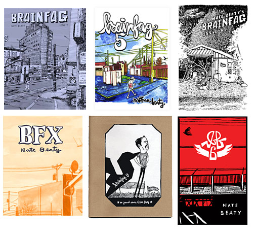
I'm hesitant to do another powerline or crow cover. But I do love the BF6 cover -- which there were only very few made (2-color silkscreen PITA cover).
1 comment on this entry
HA HA HA HA! I got through 90% of this post, to the part where I was looking at the old covers, and I thought, "Why doesn't he do something with telephone wires and CROWS? ;)
Well, you didn't have a back cover yet, right? You could still use this... Or turn it into a limited edition poster or something, for the "in-the-know" cons, to promote/celebrate the book.
I guess I agree with Microcosm... One of your beautiful bridge drawings, or cityscapes would go a long ways towards making strangers buy the book....
Commenting closed.