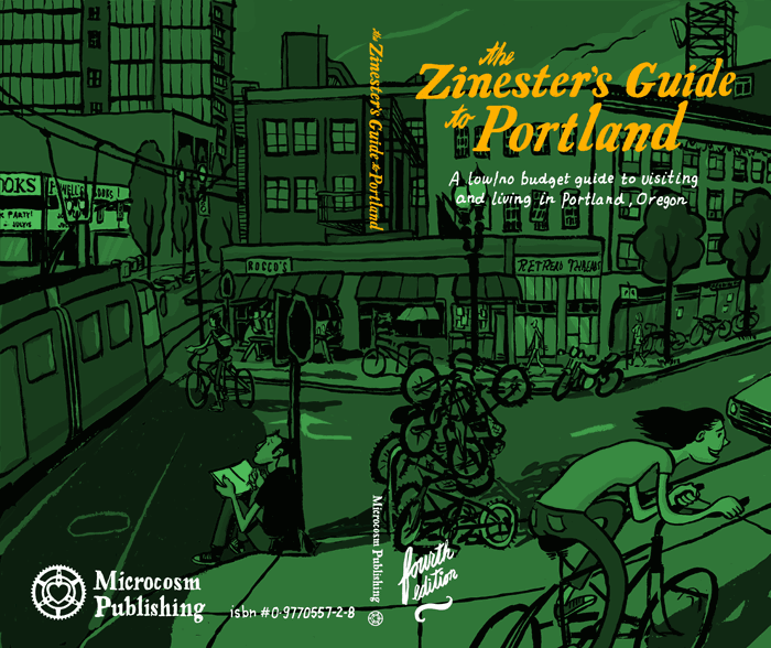
If you want help doing the colors tell me. you should work in channels instead of layers... or convert into spot channels. You won't get a black like that... but you could get a dark... maybe if you use a darker green and only use it as 100% on the lines. Anyway... you don't have to post this comment. we'll talk tonight.
aroon 7/23/05
Or you could change the title to either white or black and leave everything else the same.
Clutch 7/23/05
if in the end it turns out anything like it looks right now, it's going to be awesome. one of my favorite of your colorized ones is the red one in the bar, and this one reminds me of that one.
really nice work. look forward to seeing it in print.
5 comments on this entry
If you want help doing the colors tell me. you should work in channels instead of layers... or convert into spot channels. You won't get a black like that... but you could get a dark... maybe if you use a darker green and only use it as 100% on the lines. Anyway... you don't have to post this comment. we'll talk tonight.
Or you could change the title to either white or black and leave everything else the same.
if in the end it turns out anything like it looks right now, it's going to be awesome. one of my favorite of your colorized ones is the red one in the bar, and this one reminds me of that one.
really nice work. look forward to seeing it in print.
I agree with Clutch. Why not just make the title white and leave the two-colors as black and green? It would still look F'ing SWEEET!
white title with a black stroke, or vice versa and it would stand out perfectly.
Commenting closed.